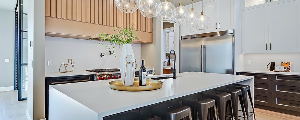
We pride ourselves on being infill specialists. When it comes to infills, we have seen our fair share of the good, bad and, unfortunately, the ugly. Thanks to our extensive involvement in the market, we are confident in sharing a few repeated mistakes that we have noted through years of experience.
If you are developing, ensure you get the most for your product - avoid these common infill mistakes to prevent being overlooked by the competition:
Small Windows/Lack of Natural Light
 The best way to open up a space is to use natural light to your advantage. Infills already get a bad rap for "feeling too tight" - even when that isn't always the case. Avoid small windows, even if they add an element of interest, and instead add windows that will let in a ton of natural light. This is especially important in smaller rooms (think the second and third bedrooms upstairs) and basements, which are notoriously called "dark" or "cramped." Max-out-the-windows. Adding linear windows high up on the walls is a great way to get natural light without compromising privacy. Similarly, adding windows to walls with stairs and/or skylights is also a great way to amplify the amount of natural light spreading throughout the entire home - although skylights can be seen as a pro or a con depending on the Buyer.
No Mudroom (and open concept mudrooms)
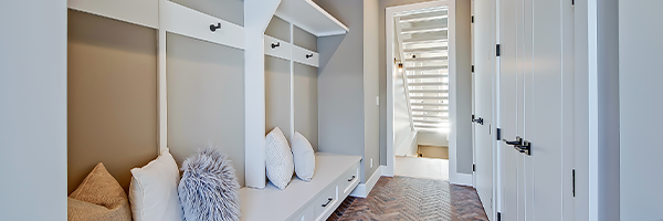 It is common to see closets at the front entrance, but we still see (quite a few) instances where there is a lack of storage and/or landing space at the rear of the home. This entrance will be used most often by the homeowners, and there needs to be storage available. Considering that most infill properties have rear, detached garages, we find it peculiar that anyone would forgo a rear mudroom and trust us, prospective buyers will point this out as well.
 While we are on the topic, let's call a spade a spade - mudrooms look great when they are clean, but when will that ever be the case 24/7? Open-concept mudrooms do add space to the living area but are ineffective when it comes to serving their intended purpose - stowing jackets, mitts, scarves, umbrellas, and dirty footwear. Closed mudrooms with concealed or varied forms of storage will go over the best with prospective Buyers (think hooks, cubbies, closets, and benches). Just because it isn't a primary living space does not mean it isn't essential.
Poor Craftsmanship
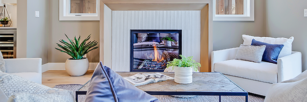 You can have the most functional floorplan, the most extraordinary lot on the block, and perfect finishes, but all of this means nothing if the craftsmanship is sloppy. Don't cut corners when it comes to quality because it will not go unnoticed - especially in a market where Buyers have ample options. Find trades you trust to get the job done right, and if it isn't correct, fix it.
Bathrooms Right off the Kitchen or Dining Room

This rarely goes over well and understandably so. While a main floor powder room is fantastic (and frankly, a must-have if you want to compete with comparable infills), a main floor powder room six feet from where you are cooking and/or eating is not the best practice. Homes with bathrooms near the kitchen will sell, eventually, but this will definitely receive consistent negative feedback and will almost always be a compromise for future Buyers.
Lack of Storage and Wasted Space in General
Lack of Storage and Wasted Space in General
 "These homes don't have enough storage" - a contender for the most common feedback we get regarding infills. Ensure there is enough storage to make the home functional - (re: mudroom), front closets, bedroom closets, walk-in closet in the master, linen closets, and, if possible, storage in the laundry room and the basement. If it is within the budget, quality built-in closet organizers are a significant upgrade. They will give the illusion of a higher-end product to buyers who compare your property to others on the market. On the same note, avoid floorplans with wasted space. Sitting rooms/areas are great, but you don't need three of them. A well-considered floorplan will go a long way. This leads us to our next mistake…
Ineffective Floorplan/Layout
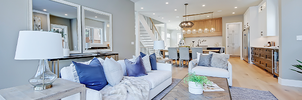 There is a reason why experienced/successful home builders often repeat the same floorplan several times - it's because they work. If you consistently get negative feedback on a particular element of your trusted or new floorplan, it is time to return to the drawing board. It may seem enticing to go outside of the box to create something "totally different" from anything on the market but avoid the urge to do so. There is a formula that just works for infills. Don't try to re-invent the wheel here; it will cost you.
Small Bedrooms
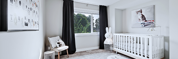 Small bedrooms are such a deterrent for Buyers, and we cannot stress this enough. We understand that the second and third bedrooms won't be huge, but it is crucial to make sure they are functional. Consider that a double bed is 5' x 7' in size and think about how tight a 9' x 9' room will feel with only a bed in it. It is also incredibly frustrating when these bedrooms are minuscule, yet you could do a cartwheel in the laundry room. This goes back to that functional floorplan talk.
 A perfect example: We recently had a new infill for sale that was high quality and in a great location. Suddenly, we noticed showings altogether drop off - literally, radio silence. Not one, but two, comparable new infills sold on the same block during this silent period. When we reached out to the Buyers' realtors as to why they didn't even look at our listing, we got the same answer - the buyers weren't willing to look at anything unless the secondary bedrooms were a specific size - we missed the bill by a few inches. Lesson learned.
It is a competitive market, and Buyers have options - size matters!